
Customize Looksyk's design to your liking
The design is based on the Material Design guidelines.
There are three ways to customize the design:
- Change the design or single color variables in the
settingstab in the sidebar - Changing predefined color variables in the
config/config.jsonfile (see description below) - Adding custom CSS in the
config/user-theme.cssfile.
The following color values are supported:
- Predefined browser-colors (e.g.
black,white) - RGB
rgb(R, G, B)(e.g.rgb(255, 0, 0)) - RGBA
rgba(R, G, B, A)(e.g.rgba(255, 0, 0, 0.5)) - Hex
#RRGGBB(e.g.#FF0000) - HSL
hsl(H, S%, L%)(e.g.hsl(0, 100%, 50%)) - HSLA
hsla(H, S%, L%, A)(e.g.hsla(0, 100%, 50%, 0.5))
The design consists of the following elements:
primaryColoris the color of the primary elements (e.g. links, buttons)backgroundColoris the color of the backgroundforegroundColoris the color of the textprimaryShadingis the color of the shading, used for the sidebar, the hover effect and the active elementappearanceis the appearance of the application, eitherdarkorlight. This is used to set the default color scheme of the application. The default value isdark.
Inspire yourself with the following examples (all avaliable in the settings tab):
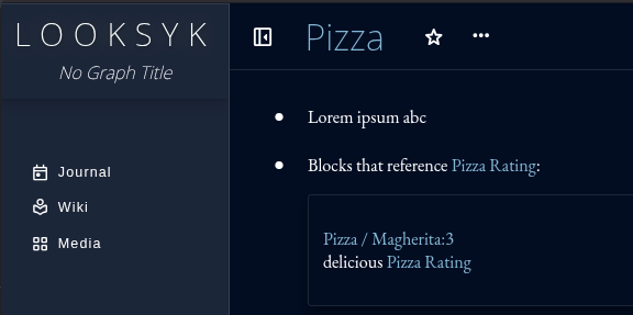
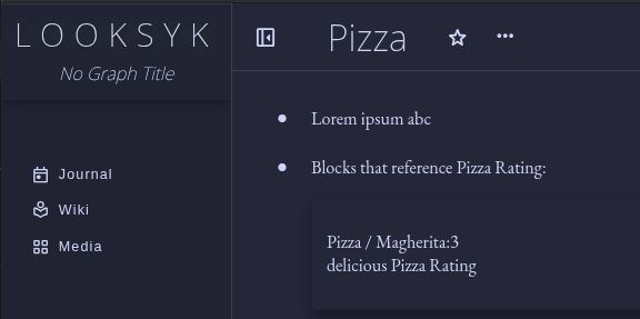
Theme: Glacier (default)
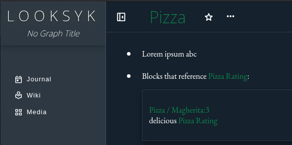
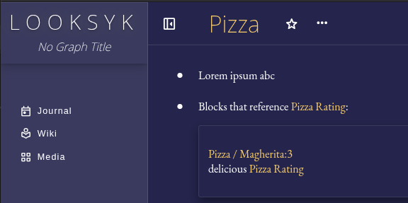
Theme: Moss
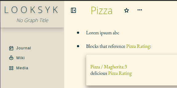
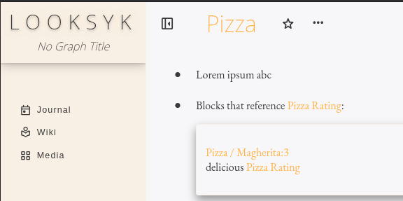
Theme: Light
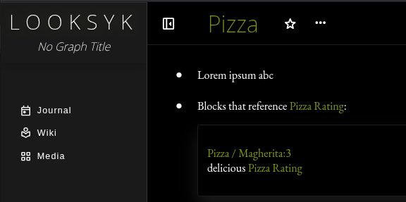
Theme: Extra Dark
Theme: Modern Dark
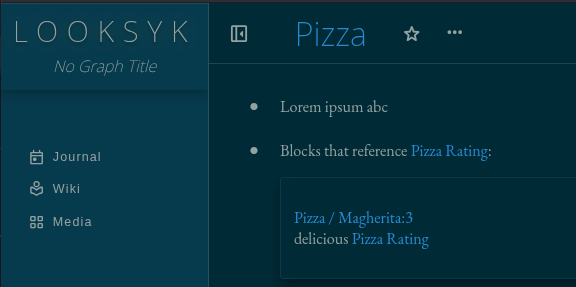
Theme: Solarized Dark
Theme: Pastel Light
Theme: Icon based colors